Designing for High-Stakes, Time-Critical Systems 🪖 | ST Engineering
Mission-critical software design.

Role
Being the sole UX designer within the agile project team, I led idea conceptualisation based on user needs, designed end-to-end user flows, and the overall visual and interaction design.
Note: Due to the sensitive nature of this project, I am unable to elaborate on the details. This case study focuses on process, research, and design decisions.
DURATION
May 2025 - Present
TOOLS
Axure RP, Lunacy, Jira, Confluence
ROLE
UX design, UI design, UX research
TEAM
UX designer, developers, project manager, product owners
Project Sample: Status Indicators
🔍 The Problem
In users' workflow, they create drafts that get populated in the main landing page table.
Whenever users entered invalid inputs into a field, in-line error validations (red alert circles ❗️) would appear. These errors required their immediate attention to correct before they could submit. The submission-readiness would be reflected in the draft's status as well (❗️).
However, the Product Owner (PO) wanted the system to still allow saving of drafts regardless.

The original status indicator column's statuses.
📝 Design Critique
I organized a design critique session to gather ideas from the whole team, allowing everyone to provide their insights from both the technical and business perspective.
During the session, I proposed to change the in-line validations to orange triangle warnings (⚠️) instead, based on the design system principles for colours.
Red circle warnings (❗️)
Immediate action required
Should prevent saving
Orange triangle warnings (⚠️)
Action required but not as urgent
Saving available
⚖️ Trade-Off
However, my proposal was rejected as I was using the same colours to signal two separate things: urgency and saving availability. If implemented, it would have introduced inconsistencies into the design system.
🌟 Final Design Decision
Unwilling to compromise on the best user experience, I continued to brainstorm for a better solution by examining the root cause of the issue.
This led me to my new proposal: to deconflict save and submission into separate concerns — save is always available, regardless of error state.
To do so, I expanded the single generic "Draft" state into three system-level statuses.
Ready — no errors, submission-ready
Ready (with ⚠️) — non-blocking issues present, but submission still possible
Not Ready (with ❗️) — blocking errors, submission unavailable
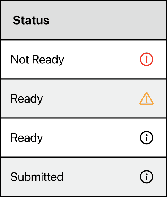
The NEW status indicator column's statuses.
With this small tweak, the coloured error indicators were flattened into a single submission-readiness signal, not a save-blocker.
📈 Impact
⏰ Time saved for users
With the introduction of the new status types, users could tell at a glance if their draft was ready for submission. No additional clicks, no guessing required. For a time-critical system, eliminating workflow steps isn't a convenience, it's a requirement.
🙋🏻 Unlocked team-wide consensus
Taking the time to recognize the real problem allowed me to provide the real solution — a structural fix, not a visual one. The final proposal was one where the whole team agreed on, which gave everyone the motivation to work on it.